An award-winning brand for the region’s premier cup competition.
When Concacaf were re-imagining their Champions League competition they approached WildPigs to join the process to develop a new brand vision for the tournament.
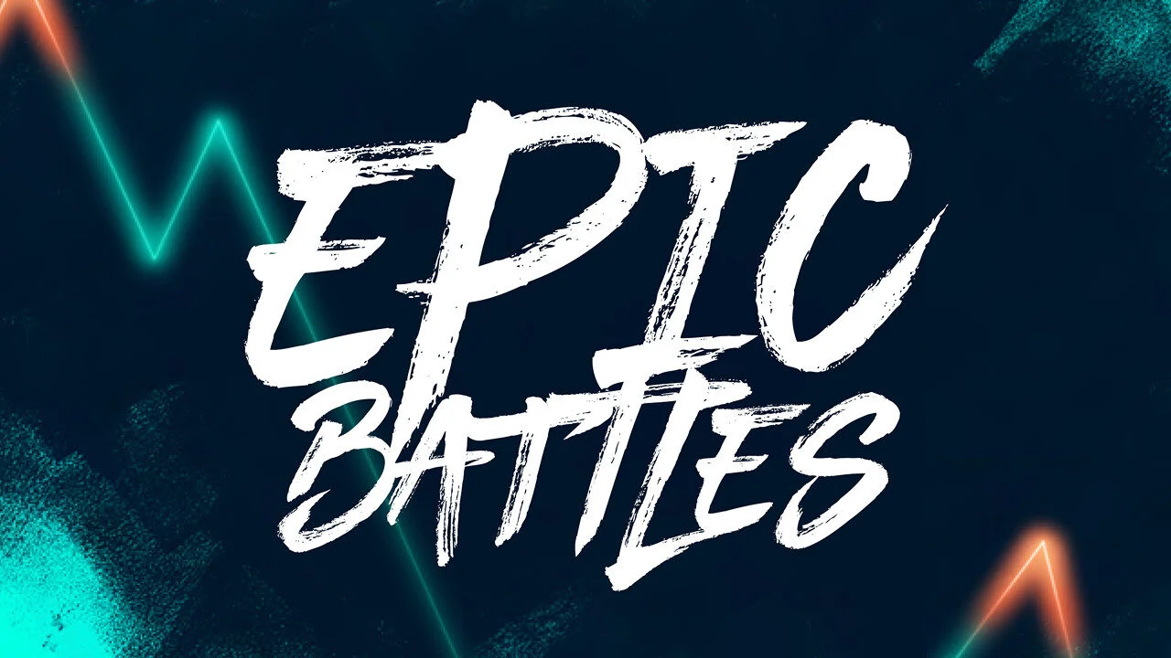
Concacaf had already completed a founding strategy for the competition, including a new name: ‘Concacaf Champions Cup’, a revised approach to Partnership structures, an expanded tournament, and a new Positioning: ‘Epic Battles’.
It was agreed that ‘Epic Battles’ and everything it stood for should be at the heart of the new brand. ‘Epic Battles’ comes with multiple meanings and is founded on the idea that when it comes to the Concacaf Champions Cup it is “hard to get here, hard to play here, and even harder to win here”.
WildPigs has created a brand and campaign that has elevated the Concacaf Champions Cup to the next level. They understood the historical significance of the tournament and the passion it
ignites among fans across the region. With meticulous attention to detail and a deep understanding of the target audience, WildPigs has crafted a stunning visual identity and campaign that brings our strategic vision for the tournament to life and perfectly captures the essence of the
competition.
-Juan Ascanio, Head of Brand Marketing, Concacaf
The Logo
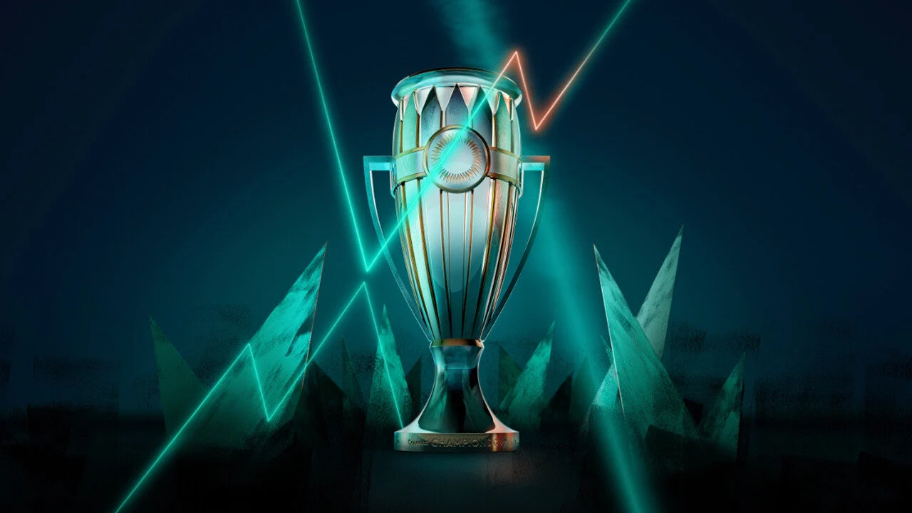
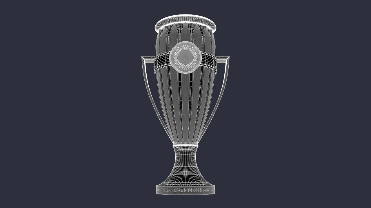
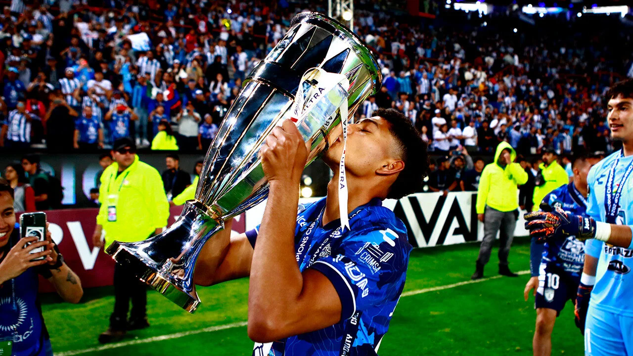
As the ultimate prize and to reflect the new name of the tournament, it was decided early in the process that the Trophy should be the dominant feature of the new logo. WildPigs approached this with a determination to build story into the portrayal of the logo rather than simply producing a representative illustration. At a glance the finished mark takes the form of the Trophy, but inside this are several creative ideas; the handles give a sense of a head-to-head, they also form a silhouette of the Trophy body, between them they ‘hold’ a triple ‘C’ device which represents the initials of the competition and reflects the Concacaf Unity Symbol, at the top there is a shape simultaneously representing the energy of the fans and a crown, the latter signifying the elite status of the competition.
The logo also contains a Wordmark, this was developed with a sensitivity to the style of the pictorial elements, emphasis was placed on the approach so as not to overtake from the drawn component and to make every effort to create a cohesive feeling to the whole design.
Regional Brands
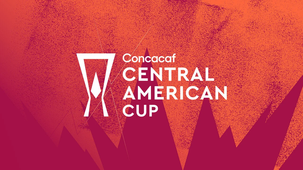
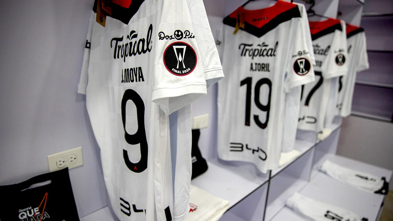
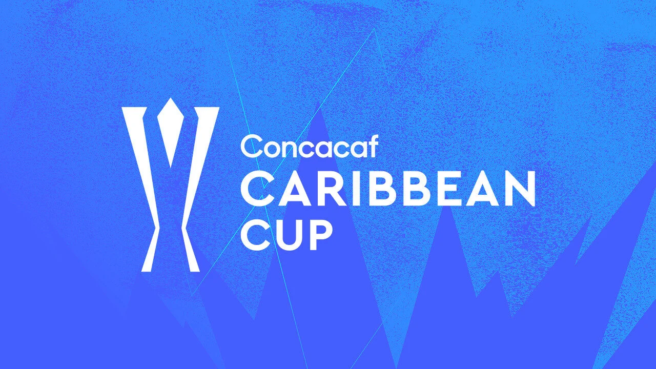
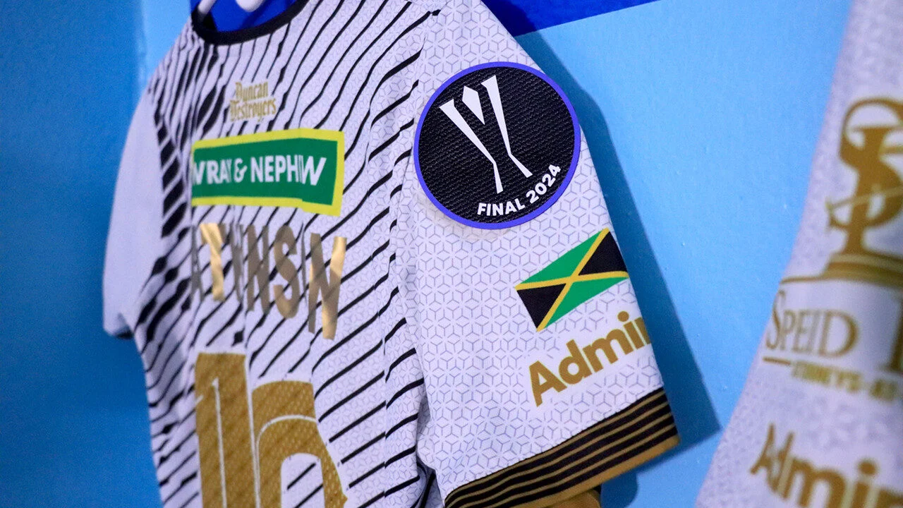
The new competition structure required an expansion of the brand to represent the additional Concacaf regions that have been brought into the Concacaf Champions Cup family. These two new brands; the Concacaf Caribbean Cup and the Concacaf Central American Cup share many principles with the Concacaf Champions Cup, but there are new logos and different color palettes which give each of them a related, but individual identity.
Logo Family
The logos for these competitions have strong echoes of the core tournament logo. The idea of a ‘family’ was established as a primary objective, to achieve this WildPigs took those same concept-based values in the creation of these marks.
Both are redolent of their individual trophies, both feature the same head-to-head geometry and inside them is a ‘diamond’ from the Concacaf Unity Symbol.
Visual Concept
As with the approach to the logo designs, the Visual Concept for the Regional Brands shares the same essence, fonts and geometries however, these are created in different colour palettes to give each the required amount of individuality and stand-out.
The Visual Concept
WildPigs prides itself on it ability to bring strategic thinking to life through visual interpretation and ‘Epic Battles’ provides rich territory for creative exploration and development. The idea underpinning the Visual Concept is to create a ‘world’ that feels edgy, tough, difficult to navigate. It’s dark. Laser lightening flashes streak through it. There are sharp, angular shapes embedded in it, there is a sense of grit in the ground texture.
Once the Visual Concept was established WildPigs developed interpretations in flat vectors as well as in 3D. This means the brand is optimised no matter where it appears, from a printed perimeter to broadcast titles.
Type plays a big roles in delivering the attitude of the new brand. There are two fonts in play; one, reserved for big messaging, is loose, hand-drawn and expressive, the other, designed to handle information and body copy, is simple and clear.
Although never quite getting to black the palette is dark. It is dominated by a dense dark emerald, this is lifted with a fresh green and pops of hot orange. The palette can be applied to photography and filmed content using pre-made gradient maps to bring imagery into the Concacaf Champions Cup world. This is not a universal rule, the Visual Concept also provides systems that work with full colour imagery where required.
Trophy CGI
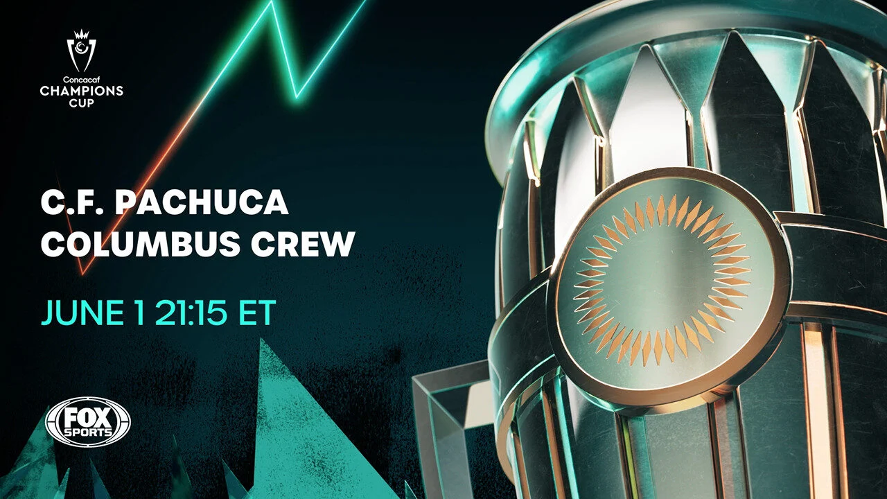
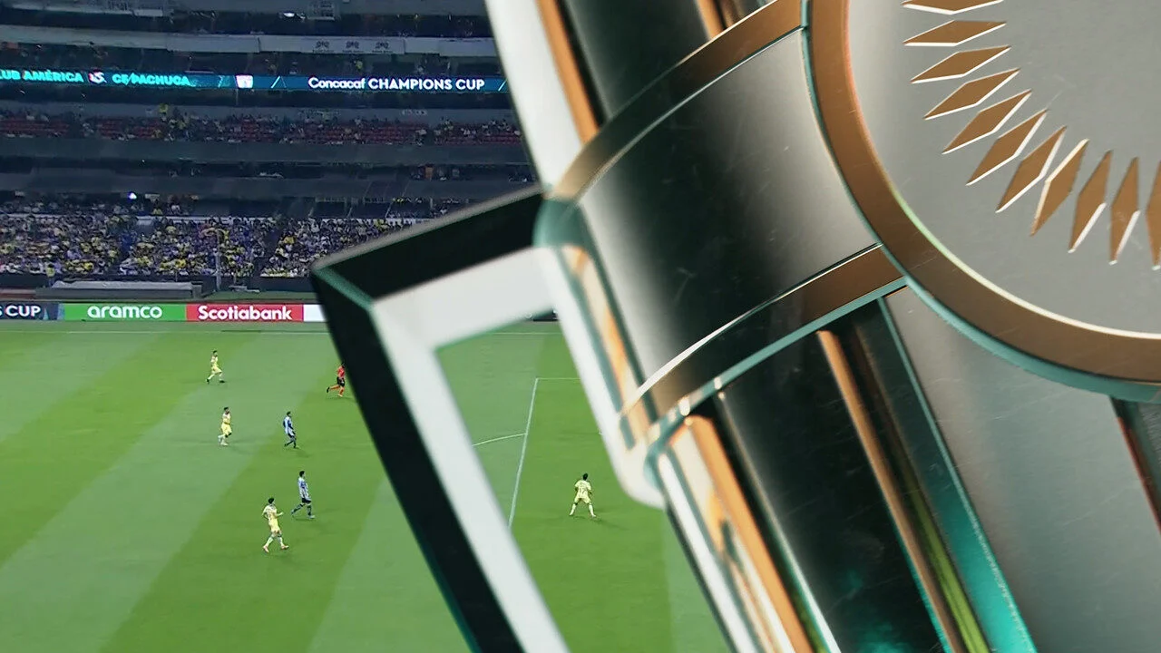
A major component of the Visual Concept is the Trophy. To provide maximum versatility WildPigs created it as a three dimensional model. This has major advantages in terms of brand consistency; versus photography a 3D model will always look and feel the same, it will convincingly reflect the colour and lighting of the Visual Concept and can be rotated and animated. Still images can be taken, negating the need for expensive photoshoots which could offer differing characteristics, and it can be used in Broadcast Sequences.
Broadcast
WildPigs has buily a suite of assets for broadcasters. This brings the whole brand and Visual Concept to life in across Opening Sequences, Promo Openers, Endboards, Action Intros and Wipes. These assets are used by Broadcast Partners and can be combined with match footage to make highly dramatic sequences.
Music
A music score has been especially written for the competition. The Anthem was composed with our Positioning Concept ‘Epic Battles’ as its creative inspiration. It brings this essence to life sonically in a powerful and inspiring piece of music. The Anthem is a vital brand ingredient used in broadcast and for player walk-ons in-match.
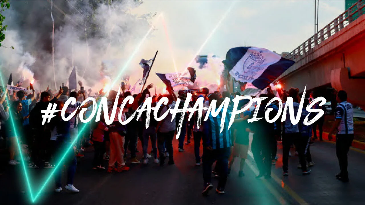
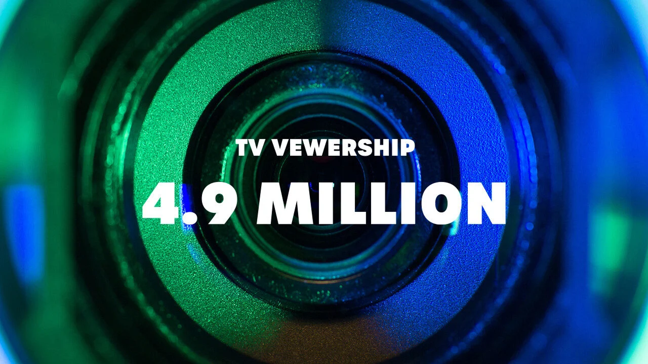
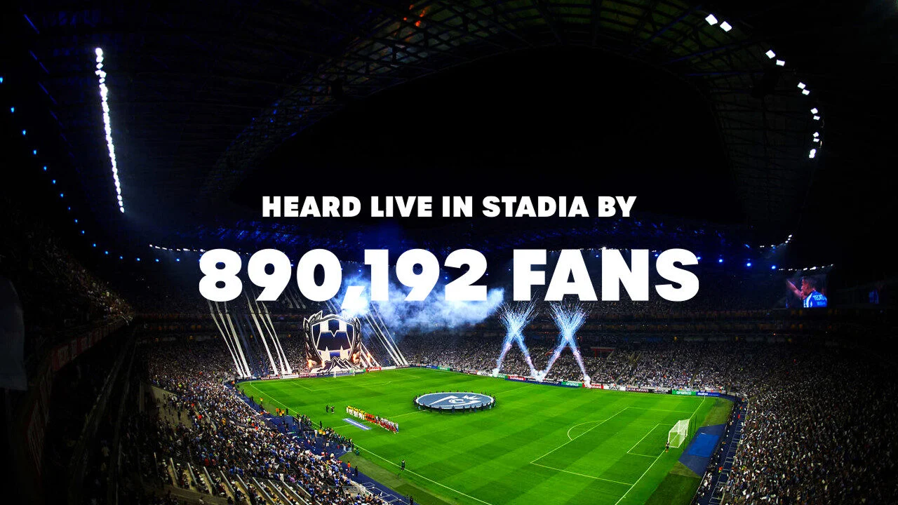
With ‘Epic Battles’ energizing every part of the story, the new Concacaf Champions League brand activates across North America, Mexico, the Caribbean and Central America. It creates a unified visual identity across this enormous footballing region. It equally represents all 27 teams that qualify, the millions of fans who watch and awards a place in the FIFA Club World Cup and FIFA Intercontinental Cup.
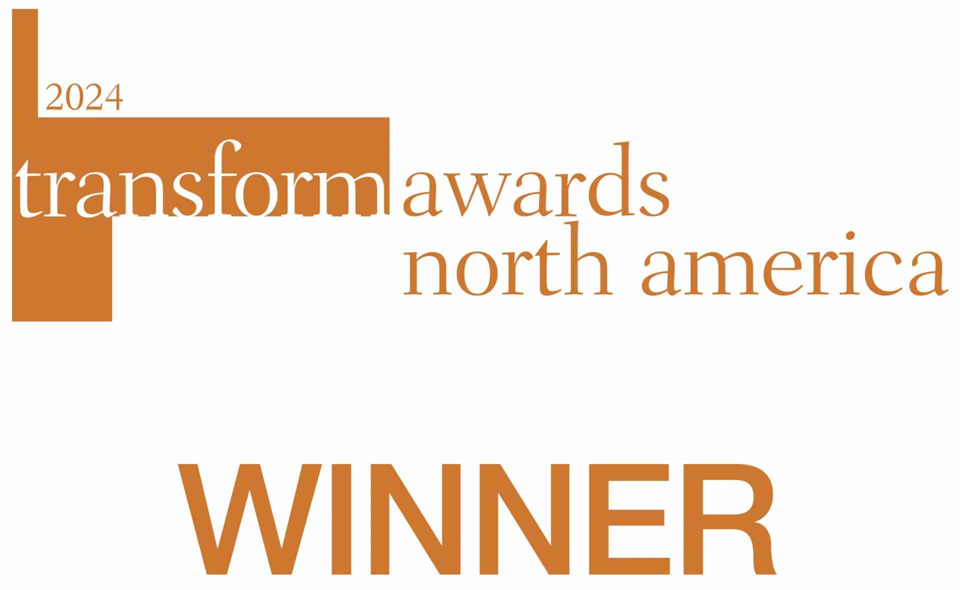
The brand won Bronze in the 2024 Transform Awards of North America.