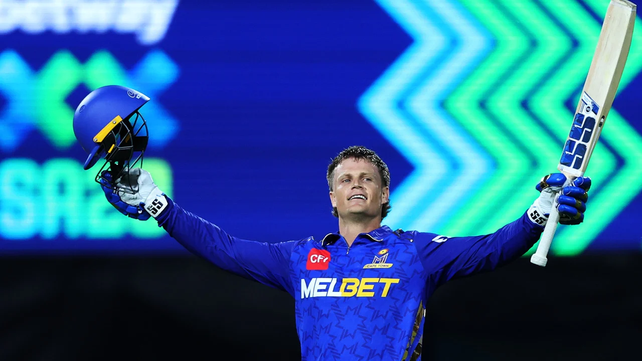
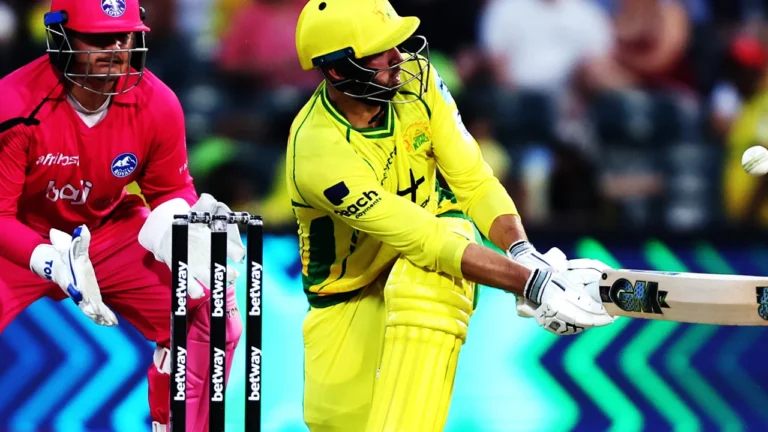
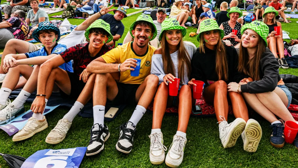
The Betway SA20 is the most widely supported T20 cricket
series in South Africa. Fiercely contested between six franchises
from across the country. Watched by millions globally.
SA20 selected WildPigs to evolve and develop a refreshed creative vision for the premier T20 cricket series in South Africa.
Parameters
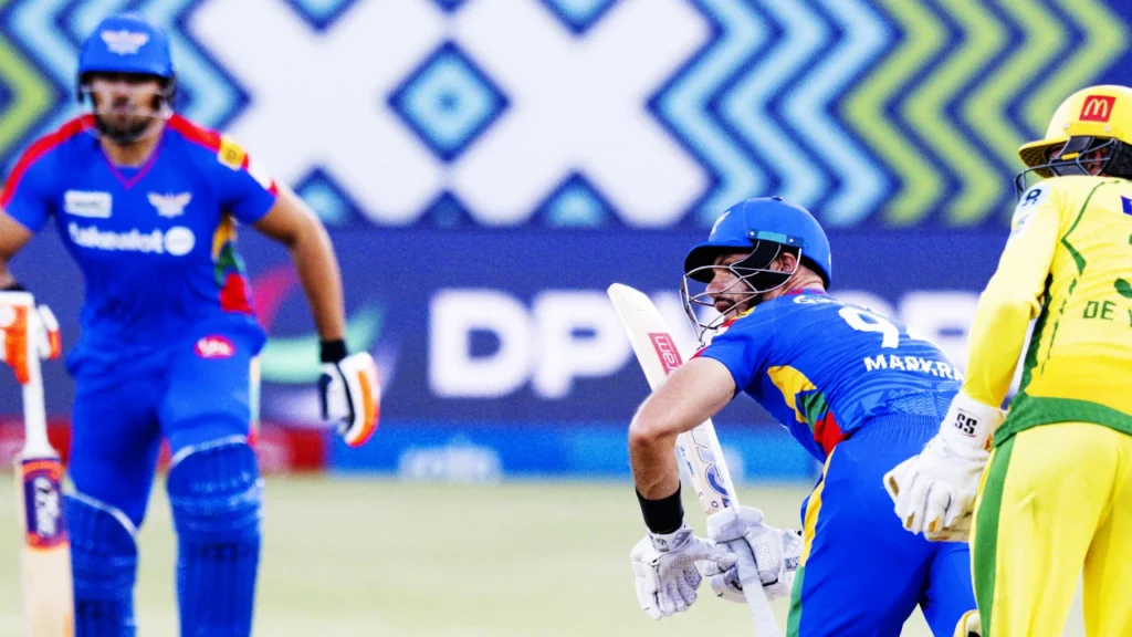
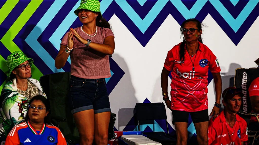
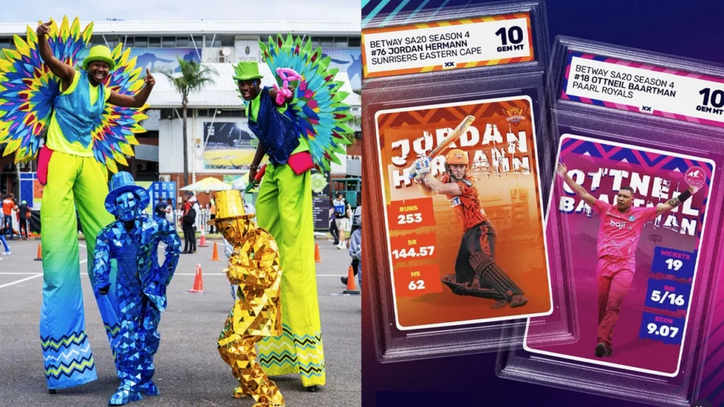
The design challenge was concerned with the evolution of the Betway SA20 visual world. The existing logo, fonts and colour space were to remain untouched. This was about impacting the big visual space and create a design that worked everywhere; in large format at the six cricket grounds across the country, in broadcast, at auction and across merchandise as well as integrating with Partner initiatives.
Direction
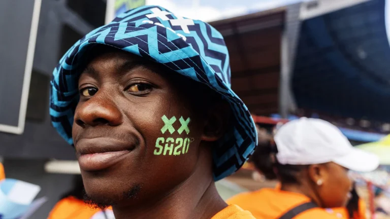
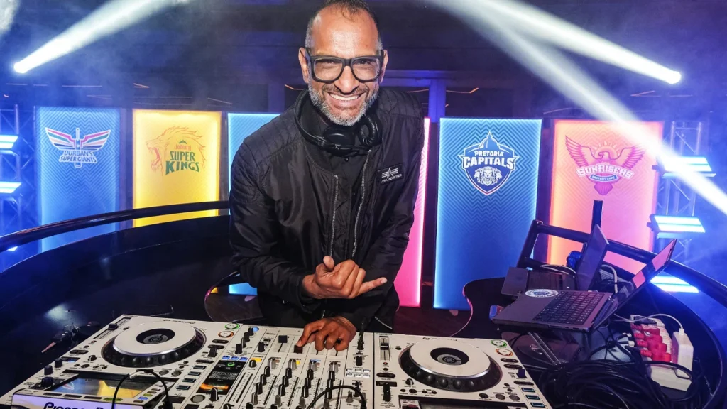
Using tissue sessions internally and with the client, WildPigs identified a design direction that would exemplify the energy of the game, the noise of the fans, the full-on vibe of match day and let these be the inspiration for creative thinking. This resulted in WildPigs developing a device called The Pulse; the creative concept that powers the design.
Design advantages
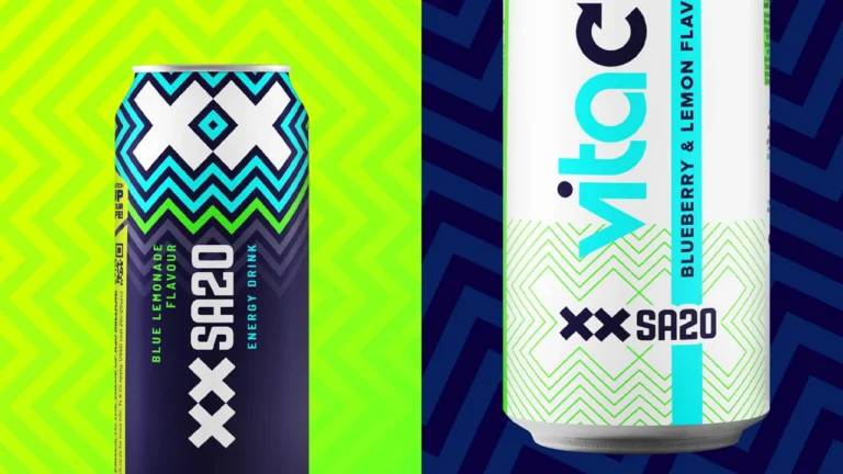
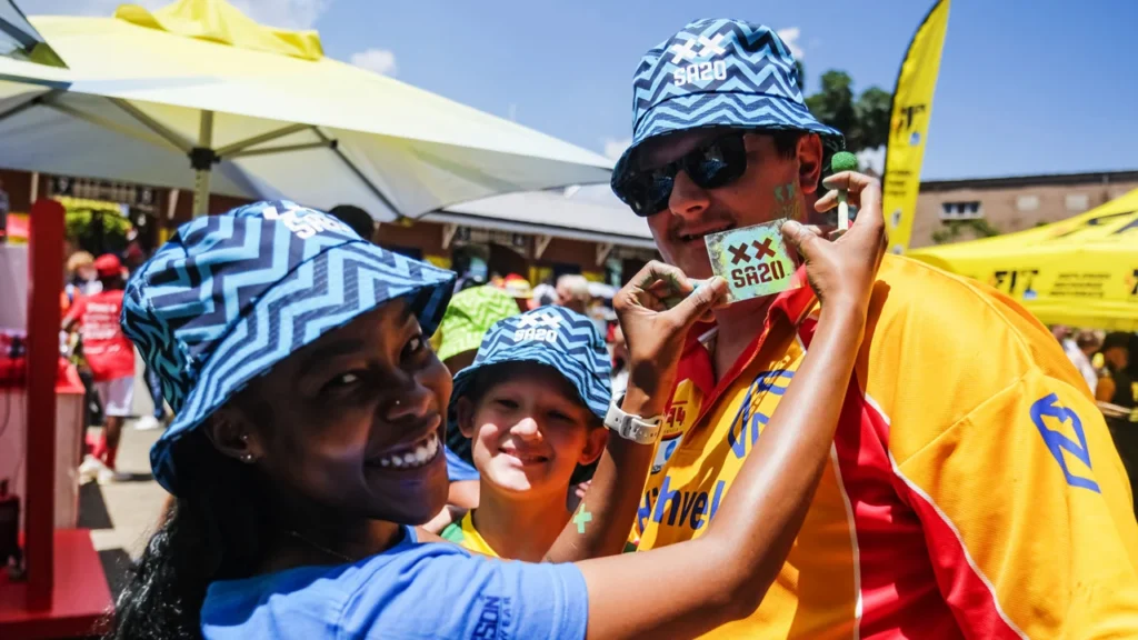
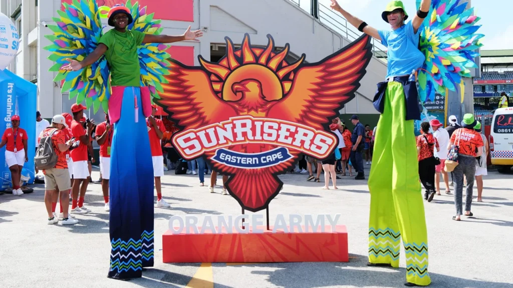
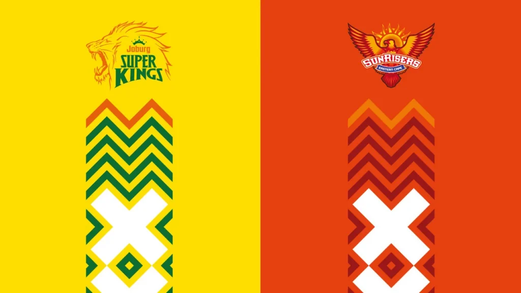
The ‘XX’ element from the existing logo gives The Pulse its life, it’s the beating heart that gives it its pace and energy, invigorating assets across infinite configurations. Allowing The Pulse to be rendered in different palettes was a strategic decision designed to encourage take-up. As a result, each of the six franchises could be represented in the new brand evolution at their home grounds and socials. This was particularly evident in TV graphics were a strong identifying presence was given to franchises in the broadcast space.